
Overview
Cayen is a UK-based wellness brand offering high-quality broad spectrum oils made with care and attention to detail. Started in 2021, the brand focuses on calm, intentional self-care, combining natural ingredients with a modern and understated visual identity.
The aim behind Cayen’s branding and identity was to create something that stands out on the shelf, a design that feels polished and just a touch refined or niche, without losing its sense of approachability. The overall look is clean, natural, and customer-focused, with subtle cues of quality that make it feel a little more special than the everyday product.
The design reflects Cayen’s values as a brand: clarity, trust, and quiet confidence.
Created using Adobe Photoshop, Illustrator.
Approach
The brand needed a strong but subtle presence that could stand out without relying on trend-based design. The goal was to create something refined and timeless, avoiding the overly clinical or overly earthy look common in the wellness space. The design direction takes inspiration from slow living, natural textures, and clean product presentation.
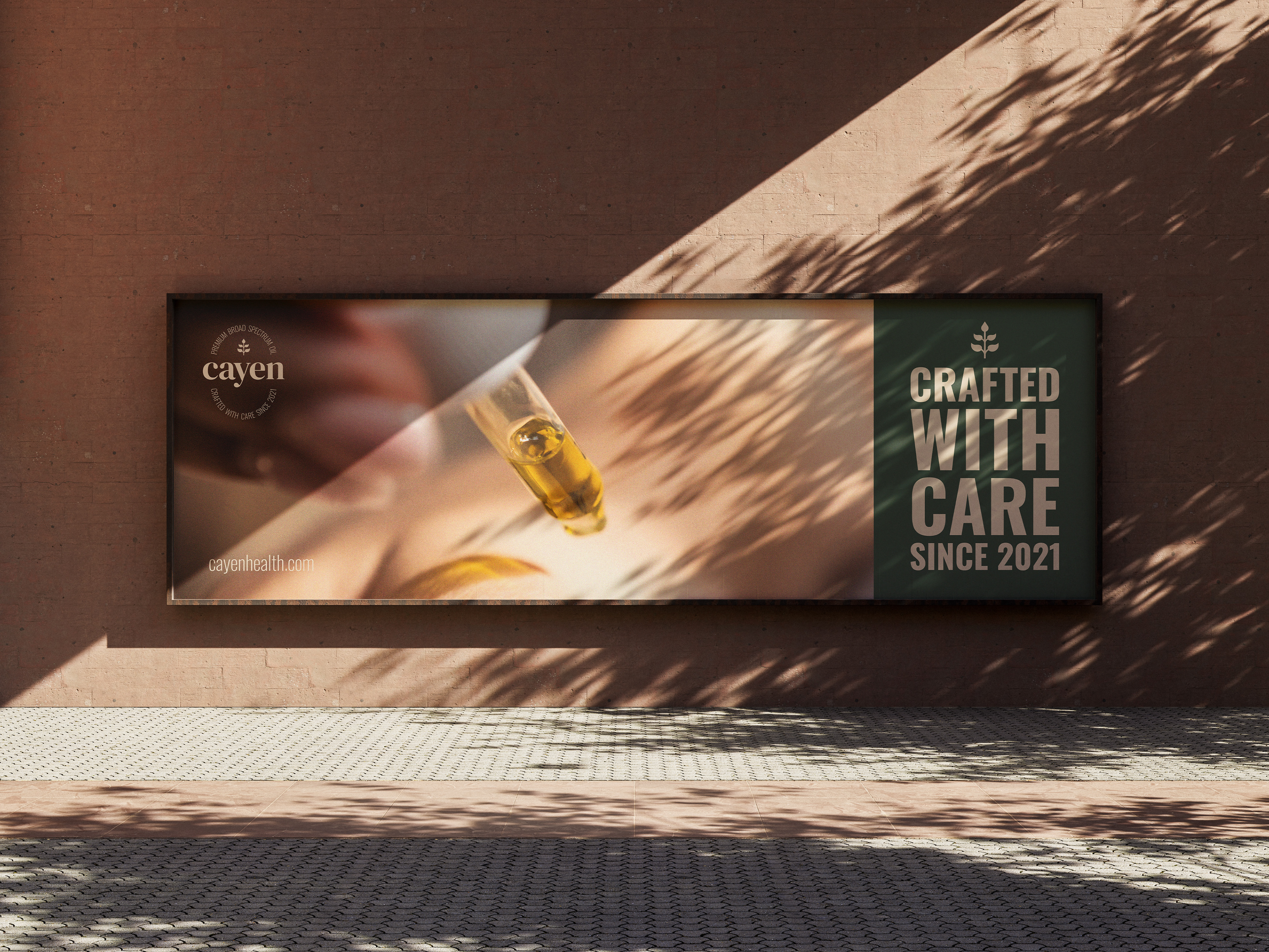
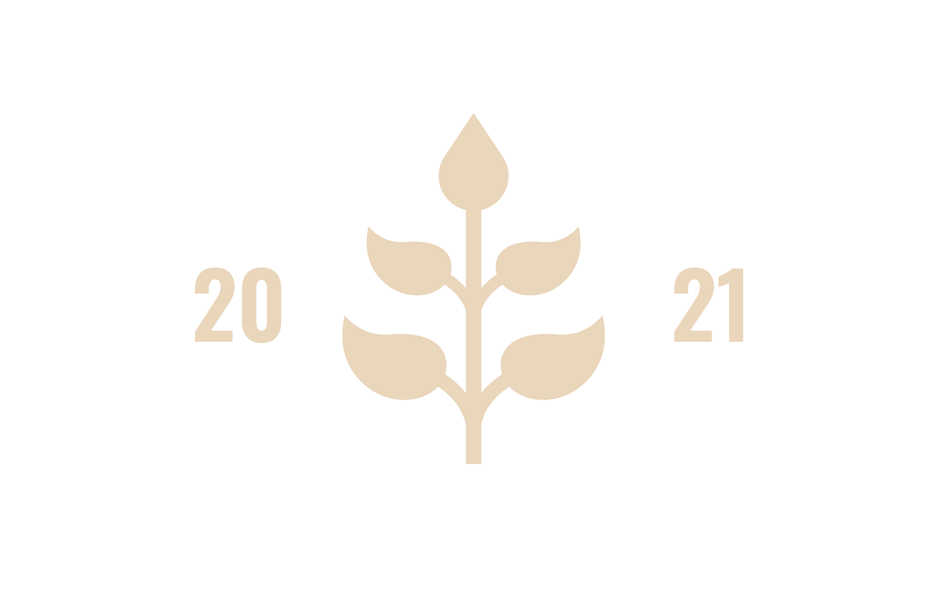
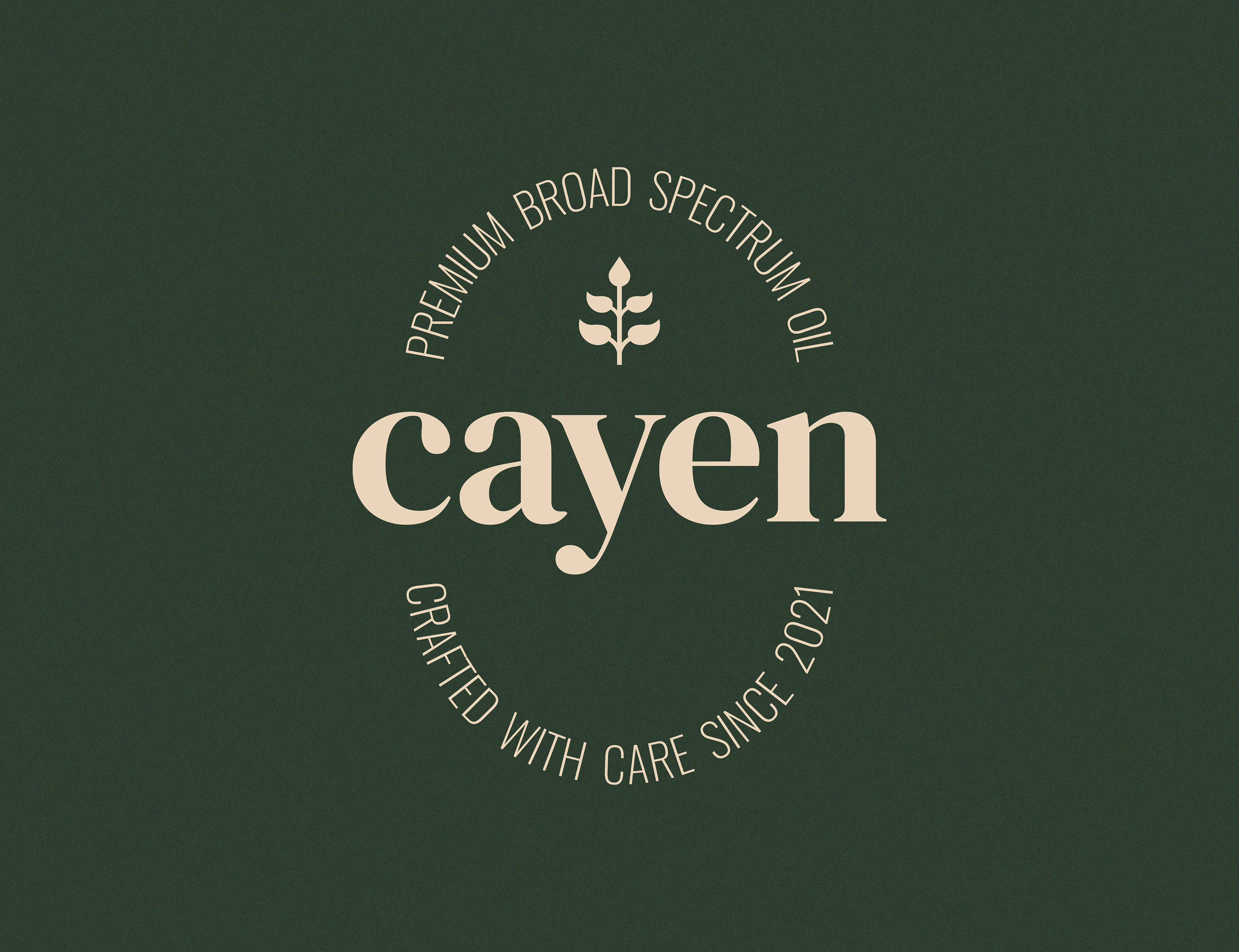
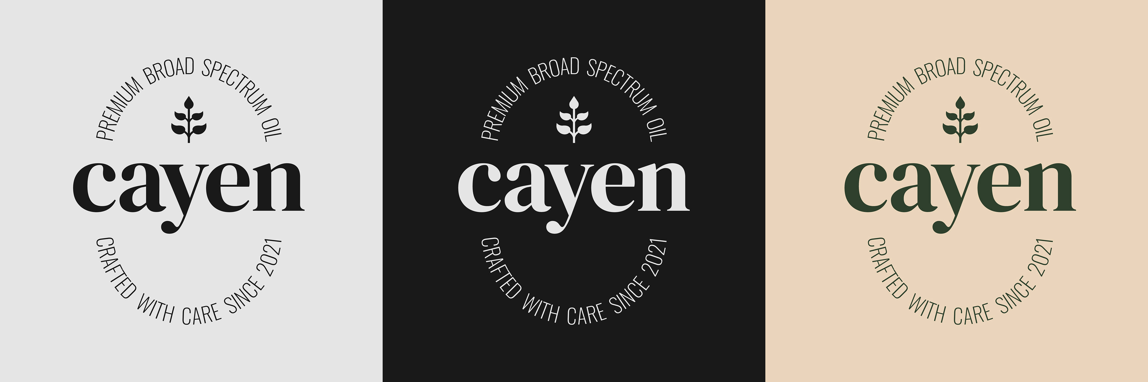
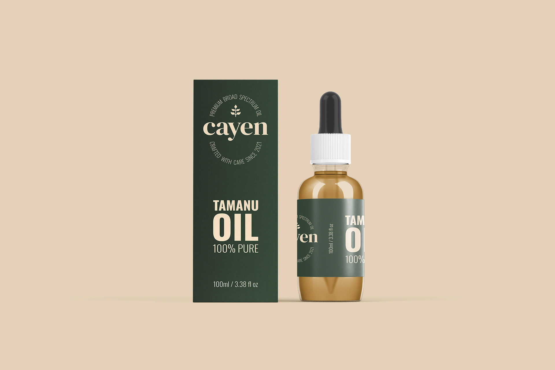
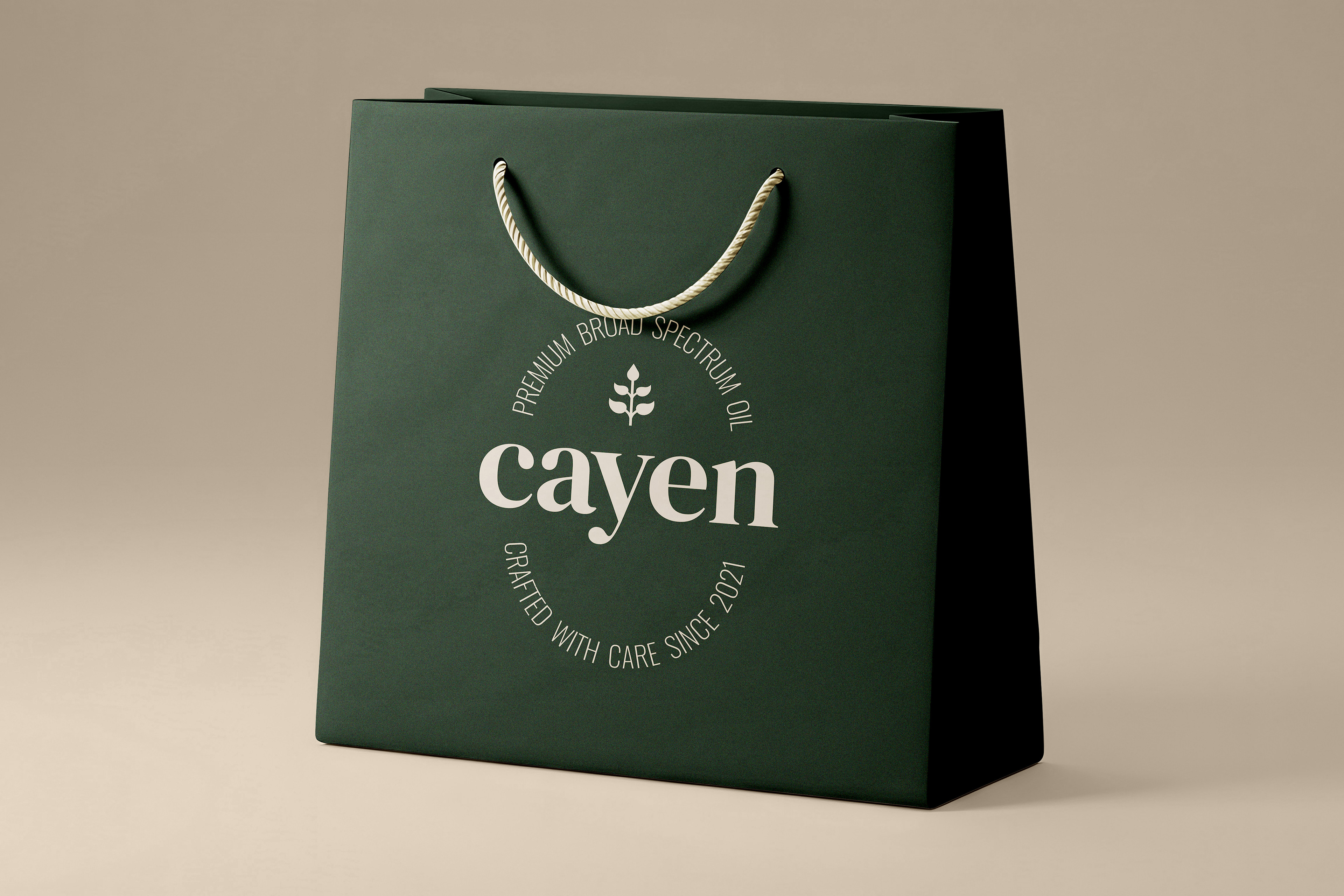
The logotype uses a soft serif with a gentle structure that feels both elegant and grounded. The brand symbol is botanical but abstract, allowing for flexibility across different oil types. The circular layout around the wordmark reinforces Cayen’s small-batch and handcrafted character, supported by the line “Crafted with care since 2021”.
Packaging Design
The packaging was developed to be clear, minimal, and honest. The bottle label and outer box use generous green space and soft, earthy colors to reflect a sense of calm and purity. Text is kept simple and well-placed, allowing the product to speak for itself without unnecessary claims or clutter.
The color palette includes a deep green and a warm neutral tone, chosen to feel natural but not rustic. The overall layout is clean and balanced, focusing on structure and simplicity rather than decorative elements.
Implemenatation
Several branded mockups were created to show how the identity works in physical spaces. These include a packaging mockup, storefront mockup and billboard advertisements. The aim was to show that Cayen could live comfortably in both retail and lifestyle contexts, with a consistent and clear visual voice.
Outcome
Cayen’s branding presents a wellness product that feels honest and well-made. The visual identity supports the idea of slow, thoughtful living without overexplaining itself. It offers a quiet sense of trust, with design choices that respect the product and the customer equally.
The result is a brand that feels modern, stable, and ready for a place in the everyday lives of people who care about what they use on their skin.
The result is a brand that feels modern, stable, and ready for a place in the everyday lives of people who care about what they use on their skin.