Overview
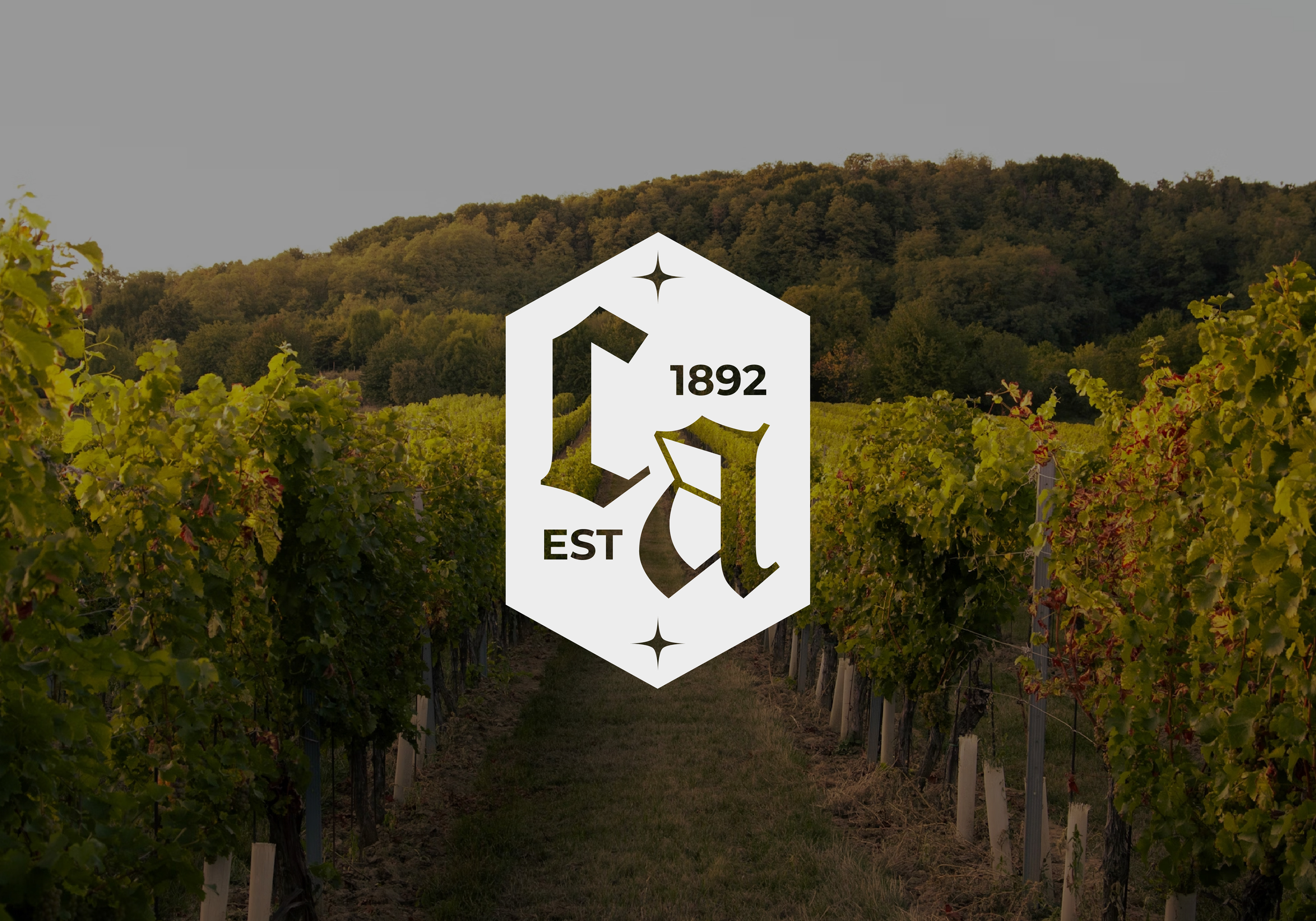
Château Alexandria is a winery located in the Bordeaux region of France, a place where winemaking isn't just a craft, but an actual way of life. The project began with the idea of building a complete visual identity for a vineyard that has a strong connection with heritage, along with a quiet, yet confident tie to modernity.
Being responsible for creating the full branding system, from the core logo to the supporting visual elements, typography, color palette, packaging design, and overall tone of the brand, the goal itself was to design something elegant, timeless, yet deeply rooted in the traditions of Bordeaux’s winemaking culture, while still feeling relevant and refined enough to stand out on a contemporary wine shelf.
Created using Adobe Photoshop, Illustrator, InDesign.
Created using Adobe Photoshop, Illustrator, InDesign.
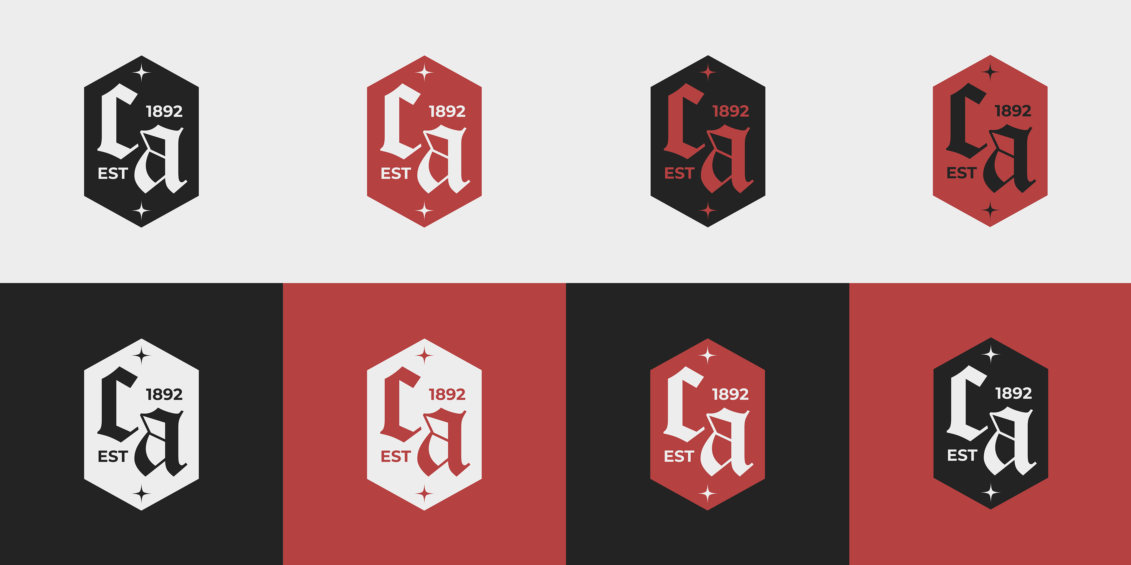
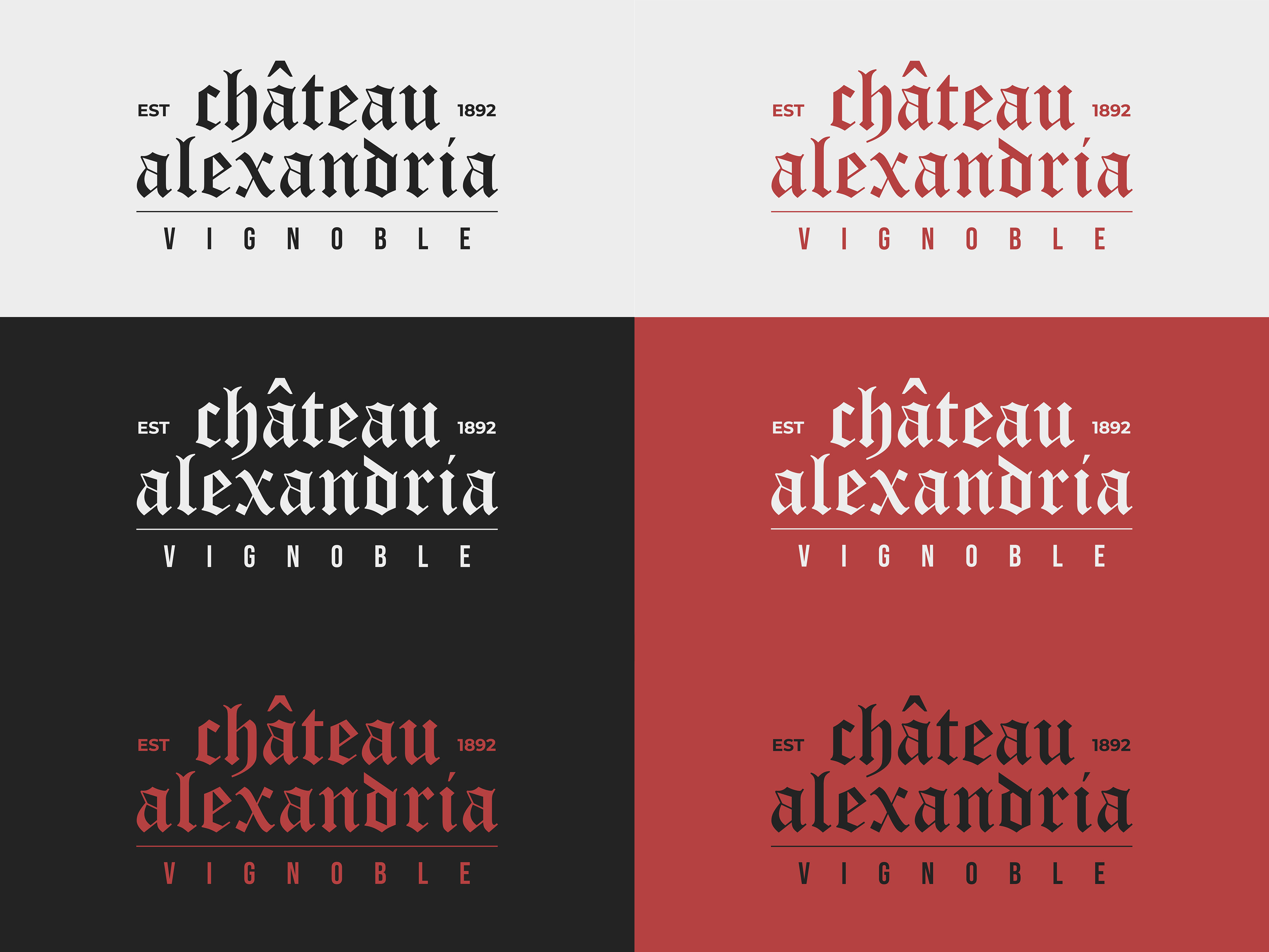
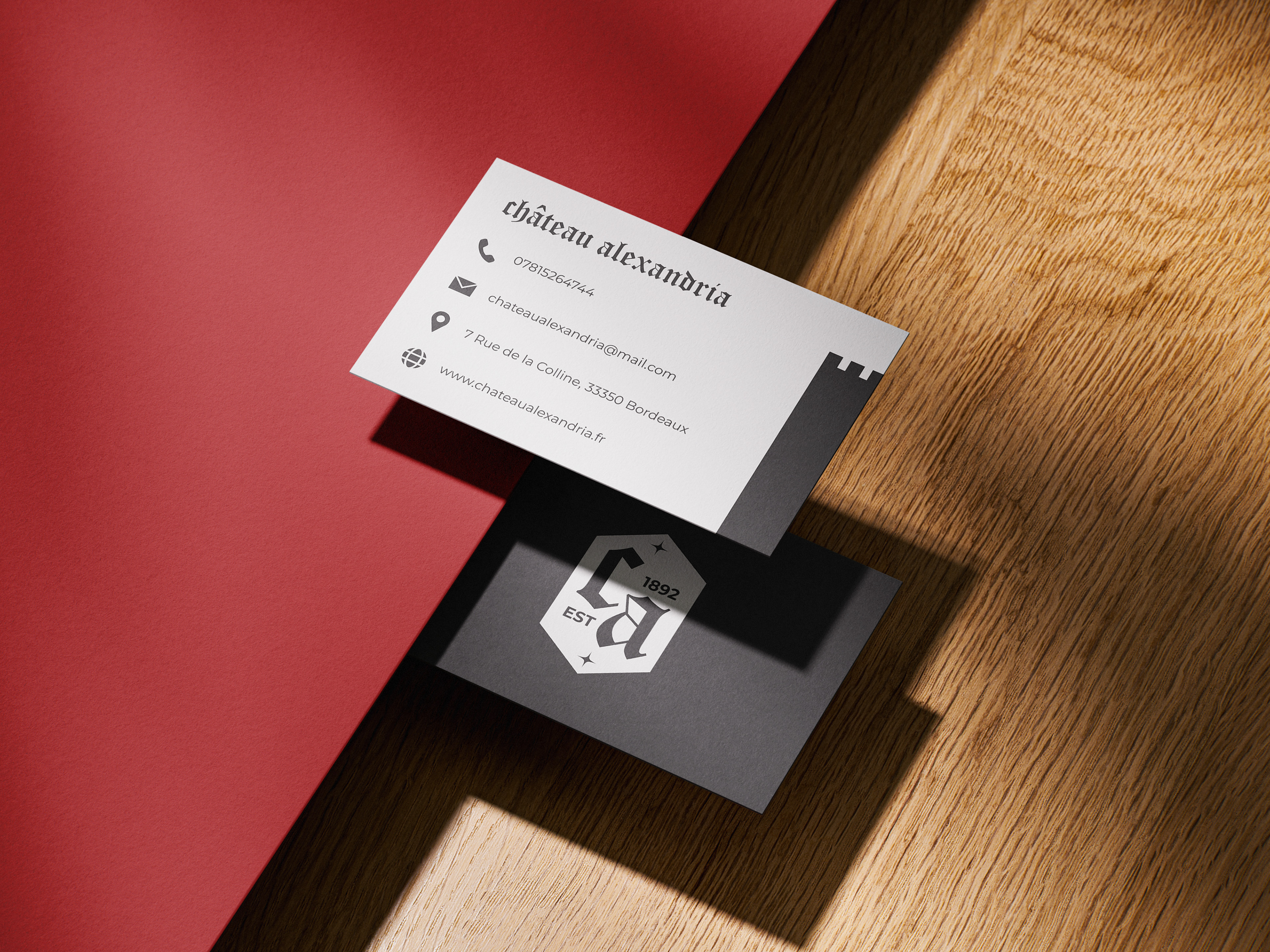
Visual Identity
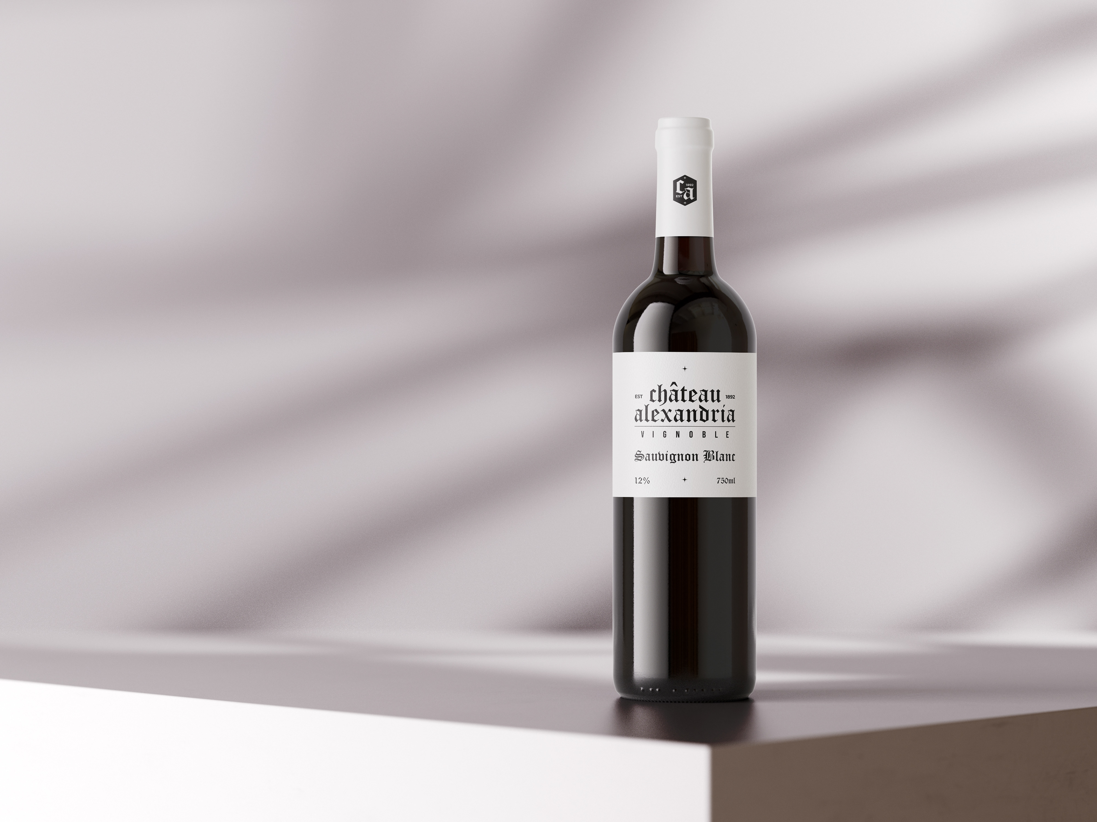
The logo takes inspiration from classic vineyard iconography, having clean lines, organic symmetry and subtle details, balanced with a strong typographic foundation that perfectly represents the brand for what it is.
The branding of the vineyard feels well established, luxurious without being loud, with a gothic/classic undertone that perfectly represents the craftmanship and tradition of the Bordeaux wine region.
For the palette, I leaned into a more simple color system with an earthy red, a faded black/dark gray, and a slightly dark white.
Typography played a key role in the brand’s identity, and I decided to go for a serif with a more classic and traditional feel and refined proportions, something that could hold its own both on a bottle and across print collateral, without ever feeling cold, kitsch or corporate. Paired with a minimalist sans-serif in supporting materials, the combination gives the identity room to breathe and shift across different formats.
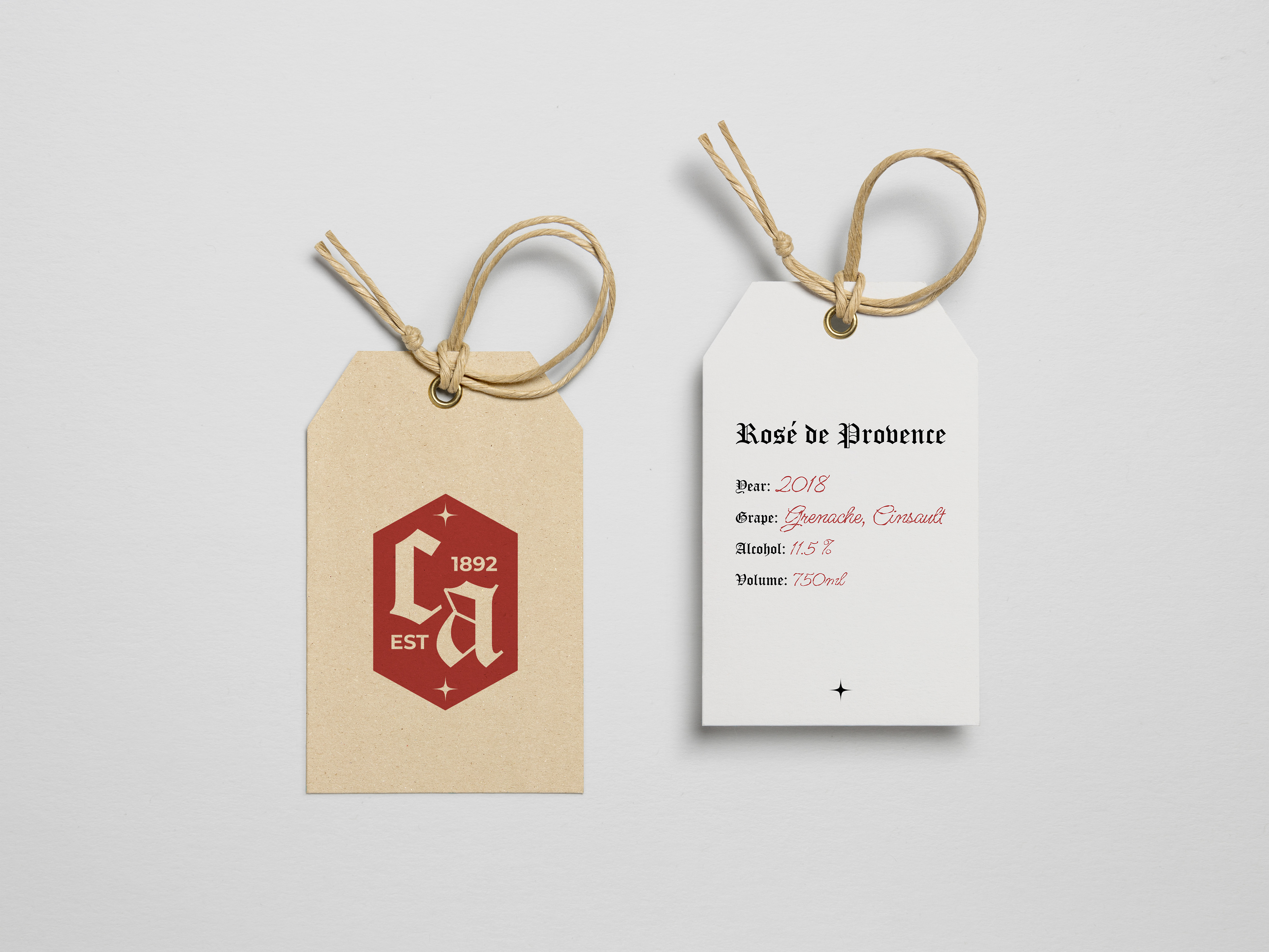
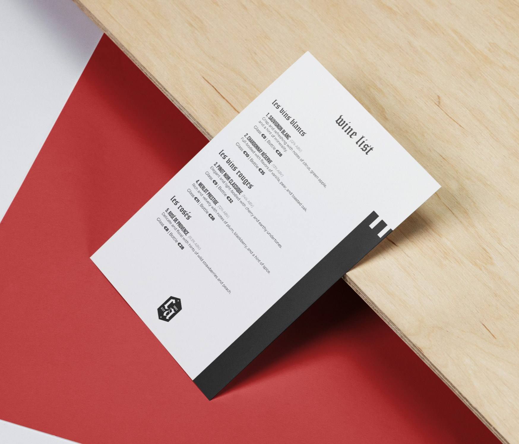
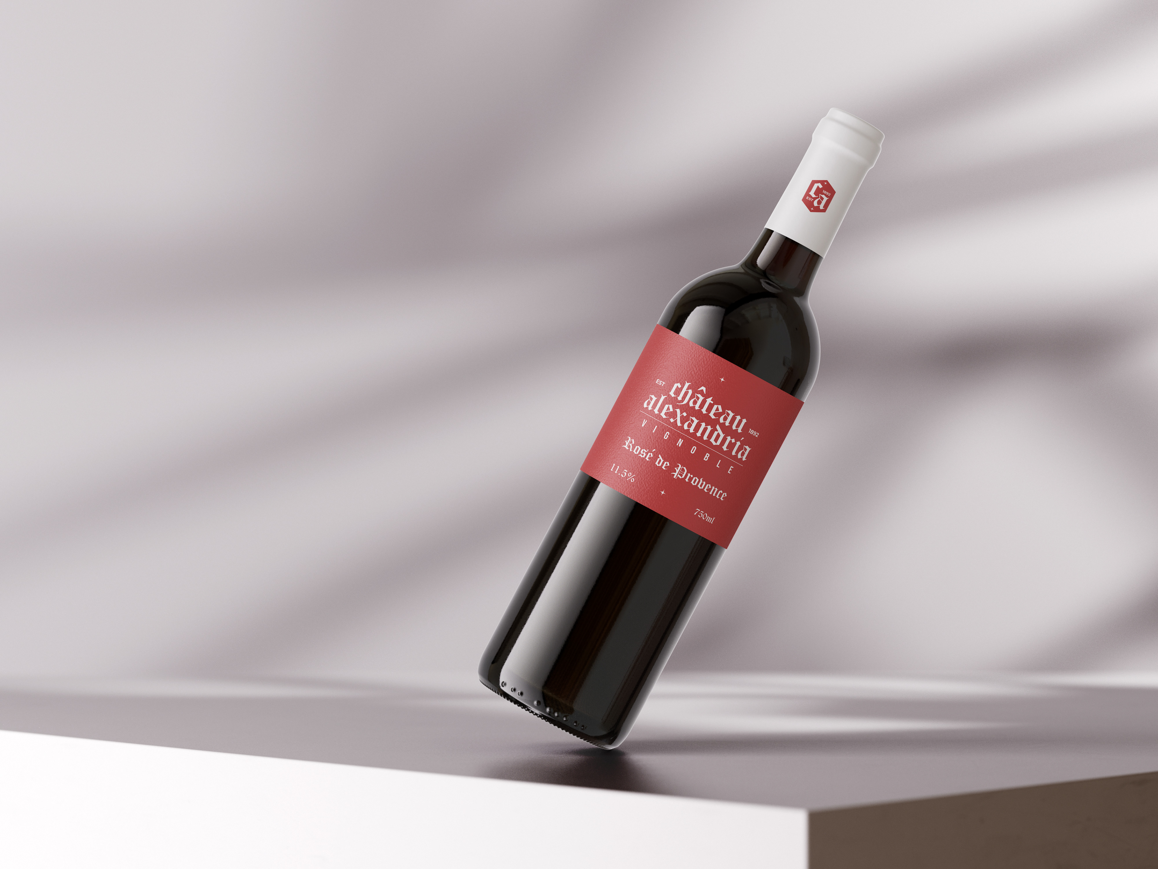
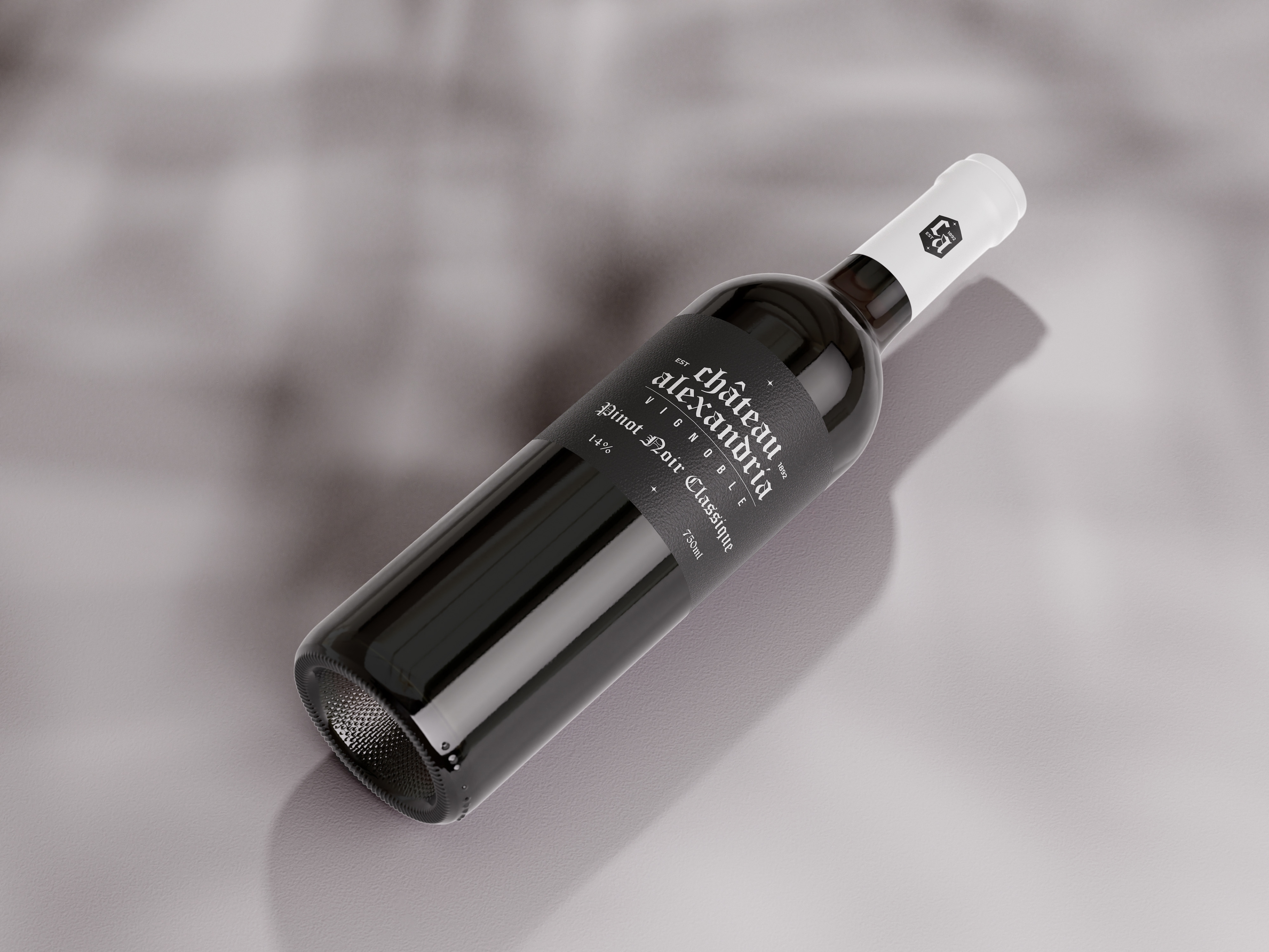
Packaging, Print & Ad Application
Beyond the visual identity, I explored packaging/label, print and advertising design for the vineyard's wine bottles, wine menu and public signage/advertisements that reflect the care and craftsmanship behind the wine itself.
Each label was designed to feel handcrafted, with more subtle textures and detailing, along with a traditional layout structure that is reminiscent of historic and traditional Bordeaux vineyards.
The idea was not to reinvent the wheel, but to perfect it and to deliver something familiar, but elevated.
Conclusion
This project was an opportunity to design a brand from the ground up with full creative control, and to imagine what a modern Bordeaux winery would look like if it respected the past, but wasn’t confined by it.
The result is a brand that feels mature, confident, and quietly elegant, the kind of presence you expect from a vineyard that has existed for generations.
Created using Adobe Photoshop, Illustrator, Adobe InDesign.
The result is a brand that feels mature, confident, and quietly elegant, the kind of presence you expect from a vineyard that has existed for generations.
Created using Adobe Photoshop, Illustrator, Adobe InDesign.