Overview
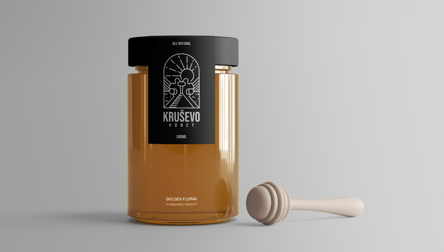
For Krusevo Honey, I developed a modern and unique logo solution that has strong ties with heritage , which can be used both as a brand mark, and as the main focus on the honey packaging.
For Krusevo Honey, I developed a modern and unique logo solution that has strong ties with heritage , which can be used both as a brand mark, and as the main focus on the honey packaging.
The packaging features a matte black finish on high-quality paper, which gives it a memorable and sophisticated look that sets it apart on the European supermarket shelves.
The logo/illustration draw inspiration from the historic Makedonium Monument located in Krusevo, but rendered as a more minimalistic line drawing with a slight emblem qualities. The rising sun behind the monument symbolizes North Macedonia's flag/national symbol and adds cultural context and depth to the whole design.
The minimalistic black and white approach, combined with the meaningful symbolism results in a packaging that feels premium, authentic, and uses visual language to invoke a feeling of nostalgia, patriotism and desirability due to its strong ties with the Krusevo region.
Created using Adobe Photoshop, Illustrator.
Created using Adobe Photoshop, Illustrator.